Charles Ephraim Burchfield, American, 1893-1967
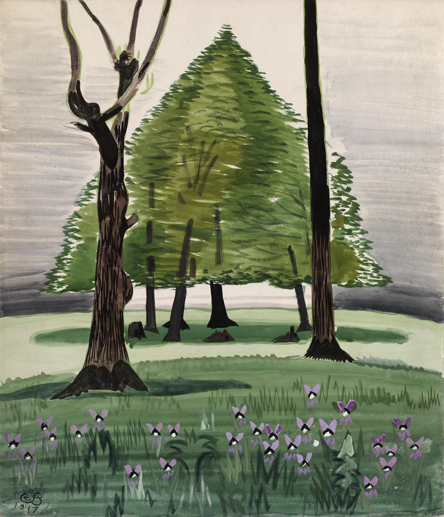
Violets, 1917
Watercolor on paper
50.8 x 44.5 cm (20 x 17 1/2 inches)
Museum Works of Art Fund 44.564
Five works on paper in the RISD Museum’s collection follow the arc of Charles Burchfield’s career, introducing and reprising themes that reveal his desire for artistic unity with nature. Burchfield’s development in the early years of the twentieth century merged an appreciation for decorative surfaces, notably those of Asian and Near Eastern art, with an imagination that was fueled by his own his experiences. Raised in Salem, Ohio, by his widowed mother, he had spent his childhood gathering impressions and images from the landscape around him.
From 1912 to 1916 Burchfield studied at the Cleveland School of Art, where his youthful admiration for the work of Aubrey Beardsley, Arthur Rackham, and Edmond Dulac led him to consider a career as an illustrator. Upon graduation he won a scholarship to the National Academy of Design, New York, but the few months he spent there in the autumn of 1916 confirmed his aversion to both figure drawing and to city life. Despite an encouraging contact with Mary Mowbray-Clarke, who showed his work at her Sunwise Turn Bookshop, he decided to leave New York before the end of the year.
Burchfield described the months that followed his return to Ohio as his “golden year.” Employed by day as an accountant at the W. H. Mullins Company, he communed with nature on evenings and weekends, producing sheets of drawings and watercolors that vibrated with the joy of his homecoming. In later years he would come back to the images of 1917, incorporating them into larger compositions that attempted to recapture the freedom and vision of his youthful discoveries. Some of these early drawings were what he called “idea notes,” including components of plant life or effects of weather that comprised a sign language of nature. In others, such as Violets, a large watercolor of 1917, his conception was fully edited and staged. In the foreground, animated violets chant an overture for a grand performance spring. In a clearing, framed by formidable sentinels, a stand of tree trunks elevates a shimmery pyramidal bower. Burchfield told his dealer, Frank Rehn, that Violets was one of his favorites and asked him to submit it to the Rhode Island School of Design in 1944 in response to the Museum’s request to see “a few of his finest early things” for purchase consideration.1

The respite of Burchfield’s golden year was short. Inducted into the army in 1918, he was sent to Camp Jackson, South Carolina, where he was assigned first to field artillery and then to the camouflage section before being dismissed at the war’s end with the rank of sergeant. During the next two years, he turned from animistic nature imagery and began to document the landscape of towns, often stripping them of color and imposing a spare architectural geometry.2 A snowy Pennsylvania Railroad crossing at New Garden Street in Salem is the setting for Gates Down, a 1920 watercolor whose composition is activated by the racing diagonal of the track and the smoke of an oncoming train. The gate has been lowered by a switchman—a rare Burchfield figure—who is silhouetted in the lantern-like tower. Opposite, the low roofs of a factory are overshadowed by a monolithic industrial block whose chimney spews brown fumes. Dark outlines and broad strokes of opaque pigment present a somber contrast to the mood of Burchfield’s earlier naturalist subjects, but he generates energy in the locomotive’s burning headlamp and in the sparking triangle of the signal lamp.

Like all of nature’s humours, snow and ice were not, of themselves, hostile elements to Burchfield. After moving to Buffalo in 1921 to take a job with the H. M. Birge & Sons wallpaper company, he was attracted by the sights of the local waterfront in winter, and soon began to paint the freighters on Lake Erie. Their commerce restricted by the lake’s icy manacles, the passive ships served frequently as models for Burchfield, and were the subjects of several paintings. In 1933 he completed Three Boats in Winter, a composition observed in the Buffalo harbor near the Ohio Street Bridge. It was purchased the following year by the Rhode Island School of Design after being shown at the Museum’s Annual Exhibition of Contemporary Art.3 Although Burchfield’s paintings of the twenties and thirties, including the Buffalo sites, were often described by critics as portraits of the “American Scene,” his own stated intentions resisted the limitations of this interpretation. “While I feel strongly the personality of a given scene, its ‘genius loci’ as it were, my chief aim in painting it,” he wrote, “is the expression of a completely personal mood.”4

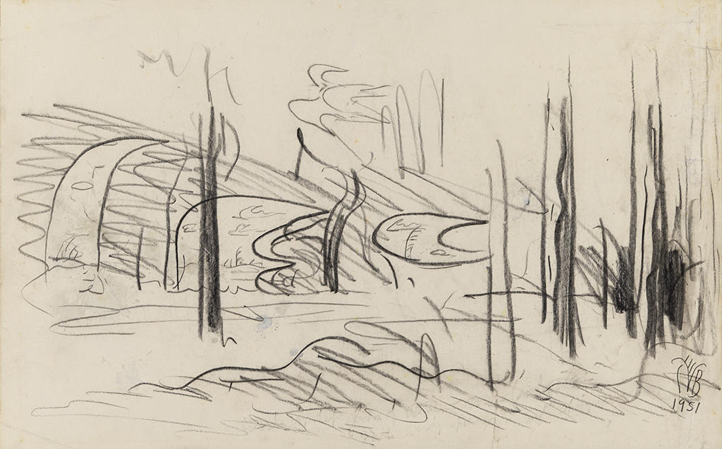
By the late thirties Burchfield identified a “determination to come to grips with nature in a way I have never done before.”5 He had already begun to reexamine his work from 1917–1918 and felt compelled to recall the intensity of his youthful experiences and to recapture the spontaneity and expressiveness of that period. His watercolors of the next two decades built on the early drawings, both literally and figuratively. In the 1940s he devised a complex methodology that involved attaching additional strips of paper to drawings he had made in 1917 and then expanding the original motifs in order to create larger paintings. He also found new ways to employ old favorite subjects, such as the striped birch trees that he used in two of his earliest wallpaper designs.6 The drawing Tree Interior, which features the trunks of striped birches, was inscribed “Study for Summer Afternoon.”7 A large 1917–1948 watercolor with that title includes aspects of the drawing’s jagged black halo and energized sky, suggesting nature’s inherent potential for change, while its armature of branches and exploding crown of foliage found their way into later paintings.8 Tree Interior may have been made on site during Burchfield’s daylong stretches in the woods and meadows near his Gardenville, New York, home, or drawn later as he recalled “great cumulus clouds piled up into huge towering masses, overhead, blotting out the sun, and casting a deep shadow over the trees and fields.”9
Burchfield’s reconstructions served as springboards to his next phase of abstract naturalism. When reapplied in maturity, the imagery that he had invented and codified in his youth became an inspired and flexible vocabulary. Of the many themes in nature that Burchfield continued to address, the change of seasons proved among the most fecund to his imagination. The drawing Oncoming Spring, a preliminary sketch for a painting of the same title,10 is one of a series of works that dramatizes the conflicting, coincidental stages that mark the end of one season and the beginning of the next. With this drawing, made three years before the completed painting, the basic elements of the painting’s structure were set in place. In a barren wooded setting, variations of crescent-shaped forms float among dark slender tree trunks. Identified as conventions in Burchfield’s 1917 sketchbook, the crescents were often used to express feelings or moods.11 But here they exist as windows in the winter landscape, revealing lightly sketched images of spring growth. Above their outlines a birdlike form ascends as a symbol of the earth’s rebirth in the coming season.
Maureen O’Brien
Curator, Painting and Sculpture
- 1RISD Museum director Gordon Washburn expressed interest in the early work when the Museum lent Three Boats in Winter to a Burchfield retrospective exhibition organized by the Albright Art Gallery, Buffalo, in 1944. A former director of the Albright, Washburn recalled Violets from a visit to Burchfield’s studio in Gardenville, New York, and mentioned this when he wrote to Burchfield on May 9, 1944, to ask if he would send a selection of early watercolors for RISD’s consideration. The artist’s dealer, Frank K. M. Rehn, responded on June 6, 1944, commenting that Violets was also one of Burchfield’s favorites (Frank K. M. Rehn Galleries correspondence, Archives of American Art, Smithsonian Institution, http://www.aaa.si.edu/collections/frank-km-rehn-galleries-records-9193/more#section_1). Burchfield had found Washburn dismissive of American Modernism during his time in Buffalo. In a journal entry dated January 16, 1939, he described Washburn as “one of the younger museum directors who is trained at the Fogg Museum in a sort of cultural vacuum… . His attitude & use of French terms were galling to me.” Describing Washburn’s European bias, he noted (January 21, 1939) that he “would stand in front of one of the most trivial and inane of Matisse’s effort[s], and say with the air of God delivering the commandments from Mount Sinai ‘This is a great picture.’” Charles Ephraim Burchfield, Charles Burchfield’s Journals: The Poetry of Place, edited by J. Benjamin Townsend (Albany: State University of New York Press, 1993), 562.
- 2Michael D. Hall analyzes Burchfield’s distinctive Modernism in “Cones, Cubes, and Brooding Shacks: Charles Burchfield’s House Pictures 1918–1920,” in Charles Burchfield 1920: The Architecture of Painting (New York, D.C. Moore Gallery, 2009); Gates Down is illustrated on page 93. Burchfield included an illustration of Gates Down in his 1928 essay “On the Middle Border,” Creative Arts, 3, September 1928.
- 3Museum of Art, Rhode Island School of Design, Catalogue of the Annual Exhibition of Contemporary American Paintings, October 3–30, 1934, no. 9. Three Boats in Winter (watercolor), lent by the Rehn Gallery.
- 4Charles Burchfield, Monograph Number 13 (New York: American Artists Group, Inc., 1945), n.p. Foreword by Charles Burchfield.
- 5Burchfield, Journals, November 29, 1938, 486.
- 6In 1921, Burchfield created two wallpaper designs in which birch trees were the dominant motif. One of these, The Birches, in the collection of the Burchfield Penney Art Center at SUNY Buffalo State, was based on this watercolor from 1917: https://www.burchfieldpenney.org/collection/object:1975-092-000-the-birches/
- 7The verso of the drawing bears the inscription: “Tree Interior” 1948 / A Study for “Summer Afternoon.”
- 8While not directly quoted in these paintings, Tree Interior represents Burchfield’s process of using drawings to establish motifs and to inject renewed fervor into his later work. Summer Afternoon, 1917–1948; watercolor, 48 x 42 in., Collection Williams College Museum of Art, Williamstown, Massachusetts; Gift of Mrs. Lawrence H. Bloedel http://contentdm.williams.edu/cdm4/item_viewer.php?CISOROOT=/wcma&CISOPTR=36&CISOBOX=1&REC=12 July Sunlight Pouring Down, 1952; watercolor on paper, 35 x 26 in., on permanent loan to the Burchfield Penney Art Center at SUNY Buffalo State https://www.burchfieldpenney.org/collection/object:v2013-0704-001-july-sunlight-pouring-down/ Summer Solstice (In Memory of the American Chestnut Tree), 1961–1966; watercolor on paper, 54 x 60 in. Image from the archives of the Burchfield Penney Art Center at SUNY Buffalo State https://www.burchfieldpenney.org/collection/object:v2012-015-001-summer-solstice-in-memroy-of-the-american-chestnut-tree/
- 9Burchfield, Journals, July 1, 1948, 518.
- 10Oncoming Spring, 1954; watercolor on paper mounted on board, 29 1/2 x 39 5/8 in.; Burchfield Penney Art Center at SUNY Buffalo State, purchased in part with support from the Western New York Foundation and the Olmsted Family in Memory of Harold L. Olmsted, 1990. https://www.burchfieldpenney.org/collection/object:1990-003-000-oncoming-spring/
- 11See Charles Burchfield, Sketchbook: Conventions for Abstract Thoughts, 1917, Burchfield Penney Art Center at SUNY Buffalo State. The conventions are widely discussed in the Burchfield literature. In later years the crescent was described by Burchfield (letter to Theodore Braasch, September 13, 1959, courtesy Burchfield Penny Art Center, Buffalo, New York) as “differing in meaning of course according to its position.” Face up, it could be “eerie or menacing—at best a pixie mischievousness”; face down, it could express “astonishment, wariness, foreboding, and also sadness, nostalgia, or worship of God,” and even “heat and its discomfort.” Pockets of wind, sound and movement might also be suggested by variations of this shape.